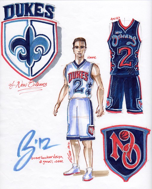
Those are all horrible.
 |
| . |
 |
Those unis are way too busy. Too busy! By the time you take it all in, Eric Gordon's already dunked on you.
I do like the New Orleans Revelers' logo though.
That color scheme would be perfect for the Reapers or Voodoo if we went that route.
http://www.flickr.com/photos/6551670...5424/lightbox/
But the mascot looks far too evil.
Wow, there's some nice stuff on there. Can't wait to see the article.
Saw your voodoo design on there. Good work.
Hey, the article's up. Here's the link. http://espn.go.com/blog/playbook/fan...e-hornets#more
so to clarify...the UNI WATCH doesn't like us using the name of a team that already exists like me and others here on the board. Where's the outrage?
That's sleek. I'm kinda warming to Dukes; even though I'm still a fan of Knights, with Dukes you can do similar things with classic-looking shield/sword/fleur-de-lis designs.
Of course most of those guys didn't use professional type design programs like BigDub, so yeah they're gonna look cartoonish and amateurish, but I can see some good potential in some of those once they're more refined. For instance this Dukes concept is veeeery nice, especially the home uni and secondary logo. Unique logo & design, yet relatively simple.
I'm still on the black & gold color scheme bandwagon though...DO IT!
I love the color scheme used for the Pelicans (Baby Blue, Yellow & Brown).
I also loved the Steamers idea.
I like the steamers concept, not so much the name steamers, but that's my favorite of the ones in the article
Cleanest by far

Wherehappens.
I was I was talented enough to make an Arcangels uni
Emeka Okafor - Joe Smith - Carmelo Anthony - Manu Ginobili - Jason Williams
Al Jefferson - James Posey - Aaron McKie - Shaun Livingston
There were some really good ones....and really bad ones.
I think my favorite was this:
But then again, I'm sucker for script fonts and clean logos. The colors with this concept really stood out to me - especially considering most went with purple-green-and-gold or black-and-gold.
Steamers makes me think of taking a dump on someone's chest. just say no.
The Pelicans concept is definitely a clean one...has a very retro feel to it, and several teams in the NBA have tried to re-embrace the retro look recently. I'm not a huge proponent of it, though. The pelican logo looks like a cartoon ducky...no thanks. With a defined tweak, a la the NFL Cardinals/Seahawks logo revamps, maybe it could be something.
I think it would make a much better baseball concept. But hey, it would definitely be that different, unique look that some of us seem to be begging for...
I wish I had a shotgun so I could shoot the Pelicans concept
Everything about that Pelicans concept screams MLB to me. It's a great design, just an iffy one for an NBA team.
To be continued in part 3 thread.
There are currently 5 users browsing this thread. (0 members and 5 guests)