Found a cool sketch on google images, it was on another forum when I clicked the link. No offense to Dub, but this is the best concept I've seen yet.
 |
| . |
|


Found a cool sketch on google images, it was on another forum when I clicked the link. No offense to Dub, but this is the best concept I've seen yet.
 Contributor

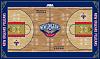
I think that's from sportslogos.net?

Very nice. I would be more than content with those.

Too much red on the away jersey for my taste.
I respectfully disagree takezor

I like the white ones
^^ can't we all agree.Originally Posted by iNolaNightmare

Contributor 

Personally, I like the ones bigdub made.
Contributor

Yeah, but what do you know?

Their pretty good, however im TOTALLY against the homecourt having any darker tone of color. If you look at our home jerseys, they wont mesh well with the darker tone of the center court. Just keep the court light wood color, I HATED the Hornets high yellow color court.
CAW CAW!!!
-Founder and valuable member of the Caw Caw Boyz-
Contributor

I agree about the court. LOVE everything else.
I love the court and the away uniforms
Formally known as WhoDatMan504

Nothing Earth shaking. Decent similar to how I feel about the logos.
Contributor

me too. hate all that red.

Their ok. Not great but not bad. Kinda simple
Contributor
Also, too many colors on the basketball court. Looks confused. Not confusing. Confused.
I say they should subscribe to the KISS doctrine. Keep it simple, Shirley.

Our court needs to be different.
Like something new and never done yet. I wouldn't mind the Pelican wings being oversized almost from 3pt line to 3pt line. Think of along the lines of what the Raptors did with their 3D looking baseline logos that almost appear to stand up. We need to embrace this chance and not stick to something that's been done yet or "traditional"
Contributor
Maybe it's time for me to do another concept!

We're all waiting for it

Is there a rule against an original, stand alone, center court logo?

dark courts are awful!

Can't wait to see ALL the unis...
Blue with red...
Red with blue...
Gold with blue...
Gold with red...
The options are limitless.

that gets me excited as hell for the new movement. i saw a pic of the new court with wings flying out of the paint...i hope that happens
There are currently 1 users browsing this thread. (0 members and 1 guests)
 Posting Permissions

 Reply With Quote