Here, I did this for ya!

 |
| . |
|


 Contributor

Here, I did this for ya!
Contributor
And here is the one for the original Krewe


Very odd jerseys, you do know those are the colors of the Dutch national flag right?Originally Posted by bigdub81

http://www.flags.net/NETH.htm

you do know that it is the flag of new orleans, right?
"Times are not good here. The city is crumbling into ashes. It has been buried under taxes and frauds and maladministraions so that it has become a study for archaeologists...but it is better to live here in sackcloth and ashes than to own the whole state of Ohio."
— Lafcadio Hearn (Inventing New Orleans: Writings of Lafcadio Hearn)
Contributor
pwned!you do know that it is the flag of new orleans, right?

Hey Sengir, are you a soccer fan?
If so what team?
I'm a big fan of the Lowlands, beers, soccer, waffles, beer, cycling, soccer, beer, chocolates....beer.

That actually looks like a real hornet!
Great stuff BigDub. The black and gold jerseys are awesome. I love how you put NOLA on the road jerseys. It looks better than having "New Orleans" on them. Purple/gold/green makes alot of sense for the Krewe and the black and gold makes sense for the Hornets.
I still prefer a name change since Hornets has a Charlotte theme.
Emeka Okafor - Joe Smith - Carmelo Anthony - Manu Ginobili - Jason Williams
Al Jefferson - James Posey - Aaron McKie - Shaun Livingston
I also love the flag jersey.

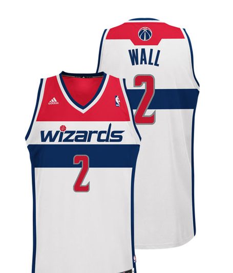
I like the flag idea more if the Wizards hadn't changed theirs back!
@DatPurpleHornet
Contributor
Like I mentioned earlier, they could be used strictly for marketing and promotions. Plus, ours look cooler!

I like these and the MGs. There is nothing cliche about purple, green, and gold.
The above can be done without the tri-color bar concept and still represent the flag (and avoid Wizards issue). Home could be all white with red and blue outline stripes or piping. The 3 fluers can be moved to the outside side panels on the shorts and shirts. Road uni can be the same with either solid blue or red. Gold numbers on both maybe outlined in red (home), outlined in opposing color (road).
Last edited by luckyman; 12-24-2011 at 12:45 AM.
Contributor
I feel where you're coming from, but these weren't meant to be everyday uniforms. Similarites to Washington aside, we wouldn't be going after their look with this set, just the implamentation of the flag of New Orleans as a uniform.I like these and the MGs. There is nothing cliche about purple, green, and gold.
The above can be done without the tri-color bar concept and still represent the flag (and avoid Wizards issue). Home could be all white with red and blue outline stripes or piping. The 3 fluers can be moved to the outside side panels on the shorts and shirts. Road uni can be the same with either solid blue or red. Gold numbers on both maybe outlined in red (home), outlined in opposing color (road).

Hey, big dubb,
Seen your work on creamer's concept board and been impressed by everything you've done. Love all the jerseys you've put forth but hate the name and hate the rebrand idea. Krewe is new orleans, but it sounds minor league. Pelicans only works for me as a baseball team. I'd like to see what you can do reworking the hornets brand. It's been ten years, a tweak is more likely than a rebrand. So, maybe we should stop thinking about how the team can be new orleans and start thinking about how we can make the hornets ours. The hornets have had a hard time shaking the Charlotte feel but the fleur de bee is strong and I'd be sad to lose it. Start from there and build out.

I thought "Krewe of New Orleans" would sound better than "New Orleans Krewe" so we would be KNO, then.

If George Shinn was still the owner then that would be his responsibility to continue selling to this fan base. Why should new ownership come in feeling obligated to continue trying to sell what Shinn has been trying to sell to this community for 10 years when they take over? I'm pretty sure new ownership would want a clean slate of what they think would sell to this fan base and that it wouldn't be an extension of what the previous regime did? New ownership is not and would not be married to the Hornets brand they inherited unless Stern mandated that they keep it when they buy the franchise.
If some guy pays more than $300 million, he gets to call pretty much what he wants. The NBA knows that re-brand means more money into the pot, so they should support it.

I seriously doubt it. Tweaking an established brand, as Shuali suggested, makes more business sense. In a struggling league (as the NBA is) the last thing that is wanted is people asking, "Who is that team?!" I think any owner of any expansion team will tell you it takes time to build the fanbase of a new team, both in the immediate area and worldwide. The Thunder were invisible to the American sports' fan until last season, as the "Krewe" would be for several years--if not longer. While the Hornets don't have a championship legacy, they do have small eras of competitive, exciting basketball.
Taking some of Big Dub's designs and teaking the colors/logos would be a good way to put a "fresh start" spin on new ownership. Starting from scratch will be an uphill battle.
Old fan. Tired fan. I want to believe.
New colors, new name - new merchandise sales, and lots of them = more money for the owner and the league.
Right now, people get confused with the Hornets and Bobcats. We can argue about this till we are purple or teal in the face, but if the guy spends the money, and wants to make the change, the NBA will approve it.

Yes but what about the new sales of new jerseys? What about the fact that 10 or so percent of NBA fans would still tell you that the Hornets play in Charlotte? What about the fact that the name Hornets is now only associated with losing Chris Paul and moving from Charlotte in the average fans eyes?
A new brand all together would be more merchandise money for the owner and NBA, and would make headlines. It would be a win-win situation. Sorry, but I don't buy your reasons against.

We've needed a rebrand for the past few years. New Orleans has been fairly slow to put all their devotion into basketball, mainly (IMO) because they have little ties to New Orleans. This would make this team OUR team, something that we have needed since the move. It would also eliminate the chance that they move, like others have said. Good work BigDub.
On a side note, who wants to design Bigdubs statue if this works out?
Contributor
Ok, Ok...here is the concept, same as the Krewe but with Hornets on the front. The second image is the same but using the Hornets purple (closer to navy), creole blue and the gold I used. Hate to say it but it's not that bad in those colors and it look's less Charlotte like!

Contributor

Not bad. Still like the Krewe unis. If we can't ever rebrand cuz the NBA needs the friggin' Hornets name attached to some team somewhere...(yeah right), they'll probably throw pinstripes on that too just cuz the NBA is like that and keep everything else.
Contributor
And here is a version of the away and an alternate away


those hornets ones are awesome, id buy one of those in a min
If Wayne is E.T.-ish tell him phone home

Those Hornets concepts are sweet.
There are currently 1 users browsing this thread. (0 members and 1 guests)
 Posting Permissions

 Reply With Quote


