.
Pelicans Report
 
Page 4 of 4 FirstFirst 1 2 3 4
Results 76 to 92 of 92

Thread: Pelicans logo design contest {merged}

  1. #76
    Irrational Optimist Contributor neworleanshoo's Avatar
    Join Date
    Jan 2002
    Location
    Carrollton
    Posts
    1,894
    Quote Originally Posted by B504ever View Post
    One of the best ones yet.... Keeps it simple and clean.

    https://99designs.com/logo-design/co...85/entries/904
    i still think it's a little too big & cartoony. most of the one's ive seen are really great but hard to imagine on a jersey without looking clunky. that's why like like the diamond-shaped modern one.

    in general i hate the ones with a basketball. it's a basketball team, we get it. and fedoras should be explicitly banned.

  2. #77
    Provided they're not too cartooney, I'm ok with any of the given designs
    Quote Originally Posted by Eman5805 View Post
    Impossible. The octopus that lives in my brain hasn't squibbered anything about it to me.


    Also, that's how octopi talk. They squibber. Yes, it's a word. Shut up.

  3. #78
    On a permanent Holiday! Purple Haze's Avatar
    Join Date
    Jan 2011
    Location
    Heart of the City
    Posts
    4,689
    Quote Originally Posted by Eman5805 View Post
    Now I like that. The sax for the L works well. I'm surprised no one has made a Pelican playing an instrument yet given all the ones they keep putting in friggin' fedoras and top hats.
    There have been a handful with trumpets in the logo, etc.
    Wherehappens.

  4. #79
    At least it's comforting knowing we'll probably have an awesome logo.

    Unlike the Thunder.
    asdfghjkl;'

  5. #80
    Banned Kurgan's Avatar
    Join Date
    Feb 2008
    Location
    Italia/Žilina/Praha
    Posts
    3,529
    Quote Originally Posted by Stealth Matrix View Post
    At least it's comforting knowing we'll probably have an awesome logo.

    Unlike the Thunder.
    The thunder have a logo?

  6. #81
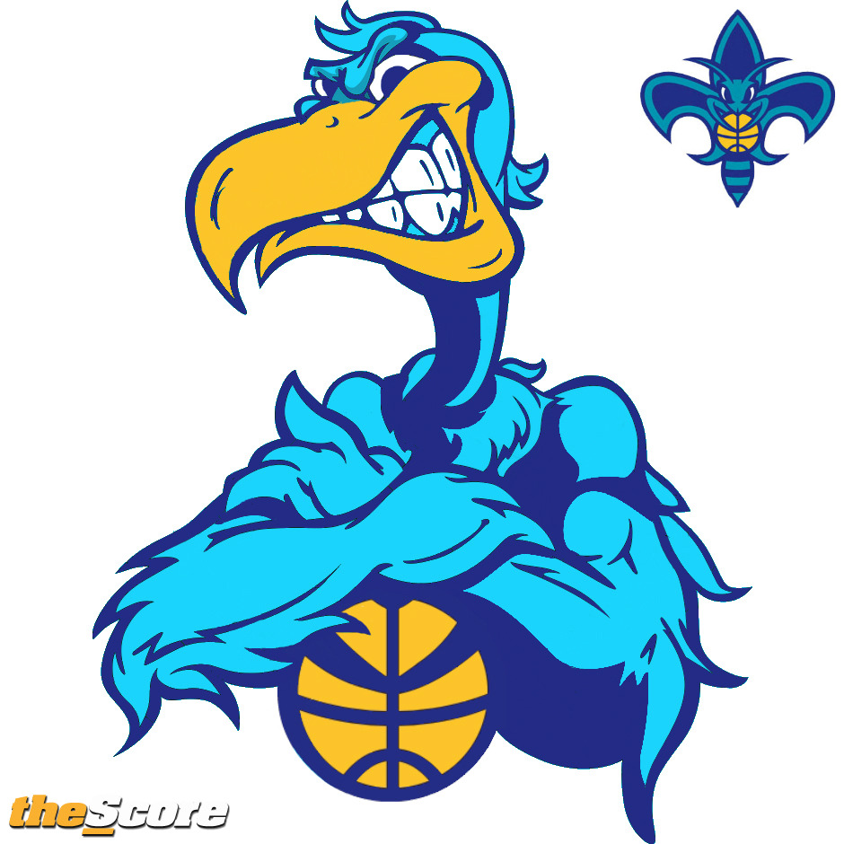
    The generic "sleek, angry animal" look that literally every high school/college/pro team has updated to since the Denver Broncos began that trend in 1997 is the antitheses of what is now happening - a move back to the lovable, fun retro 1970's logos.

    Sir Saint, the laughing Baltimore Orioles bird, the re-emergence of the goofy Nuggets and old school Bullets uniforms, the throwback Buffalo Bills uniforms from the aggressive "charging" Buffalo to the placid, standing buffalo. Miami Marlins, Houston Astros... There's plenty more examples as well.

    Ya'll are behind the trend on this - not trying to be contentious - just saying that goofy and cartoony/retro is en vogue now, is a LOT more fun and colorful, and would sell more merchandise than some second rate "glaring pelican with talons" schtick that you're trying to rip off of the Atlanta Thrashers or ULM Warhawks.

    Click image for larger version. 

Name:	atlanta_thrashers.jpg 
Views:	291 
Size:	35.9 KB 
ID:	4551 Click image for larger version. 

Name:	warhawk250x250.jpg 
Views:	333 
Size:	28.3 KB 
ID:	4552

    been there. done that. it's tired and boring and stale. These same "angry bird" logos have been done 1,000 times. Why do we want a rehash of this logo? Give us something as unique as Hugo, Sir Saint, etc.
    Last edited by WisconsinHornet; 12-26-2012 at 01:12 PM.
    "The only thing Ryno stretches is the 0's on the stat sheet." - BallSoHard

  7. #82
    A Soulful Sports Fan Contributor Eman5805's Avatar
    Join Date
    Nov 2008
    Posts
    29,859
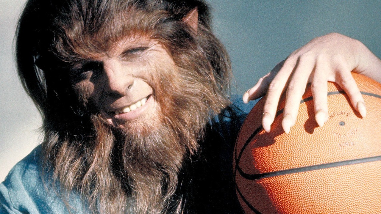
    I'm not overly concerned about what the trend is, frankly. If the trend is this...


    I'd rather go with boring and what's been done.

  8. #83
    Eman, I've heard that is the EXACT logo we're going with! Now let's keep Austin Rivers and his amazing PER on the floor for 35 minutes a game to lock up that #1 pick!

  9. #84
    Leaked image of new Rougarou Mascot!!

  10. #85
    A Soulful Sports Fan Contributor Eman5805's Avatar
    Join Date
    Nov 2008
    Posts
    29,859
    Quote Originally Posted by WisconsinHornet View Post
    Eman, I've heard that is the EXACT logo we're going with! Now let's keep Austin Rivers and his amazing PER on the floor for 35 minutes a game to lock up that #1 pick!
    What? You said goofy and cartoony.

  11. #86
    Quote Originally Posted by Eman5805 View Post
    What? You said goofy and cartoony.
    I was thinking more along the lines of this guy...


  12. #87
    A Soulful Sports Fan Contributor Eman5805's Avatar
    Join Date
    Nov 2008
    Posts
    29,859
    But I thought angry birds were gauche?

  13. #88
    That's cocky, not angry

  14. #89
    A Soulful Sports Fan Contributor Eman5805's Avatar
    Join Date
    Nov 2008
    Posts
    29,859
    Je vois.

  15. #90
    i like the one with the hat on with the fler de lies tattoo on his neck.

  16. #91

    Unofficial Pelicans logo design contest results

    Apparently a design blog, 99designs, held a Pelicans logo design competition, yielding some pretty cool logos (and some weird ones of course).

    http://99designs.com/designer-blog/2...d-top-designs/

    Here's the winner of the contest:
    Click image for larger version. 

Name:	original.jpg 
Views:	1399 
Size:	54.6 KB 
ID:	4560

    And some others:
    Click image for larger version. 

Name:	666.jpg 
Views:	277 
Size:	11.2 KB 
ID:	4561

    Click image for larger version. 

Name:	AriPerdana.jpg 
Views:	950 
Size:	52.2 KB 
ID:	4562

    Click image for larger version. 

Name:	bluegumboy.jpg 
Views:	672 
Size:	75.5 KB 
ID:	4563

  17. #92
    I like goofy and cartoony logos. I hope our mascot is adorable.

Thread Information

Users Browsing this Thread

There are currently 1 users browsing this thread. (0 members and 1 guests)

Posting Permissions

  • You may not post new threads
  • You may not post replies
  • You may not post attachments
  • You may not edit your posts
  •